playtime 1967.
In 2023, as part of my university studies, I was tasked with a project that included a live brief from the London-based graphic design firm SPIN. The brief centred on the re-launch of the esteemed French classic “Playtime” by Jacques Tati. My response to this brief is presented in the following work.
poster Design.
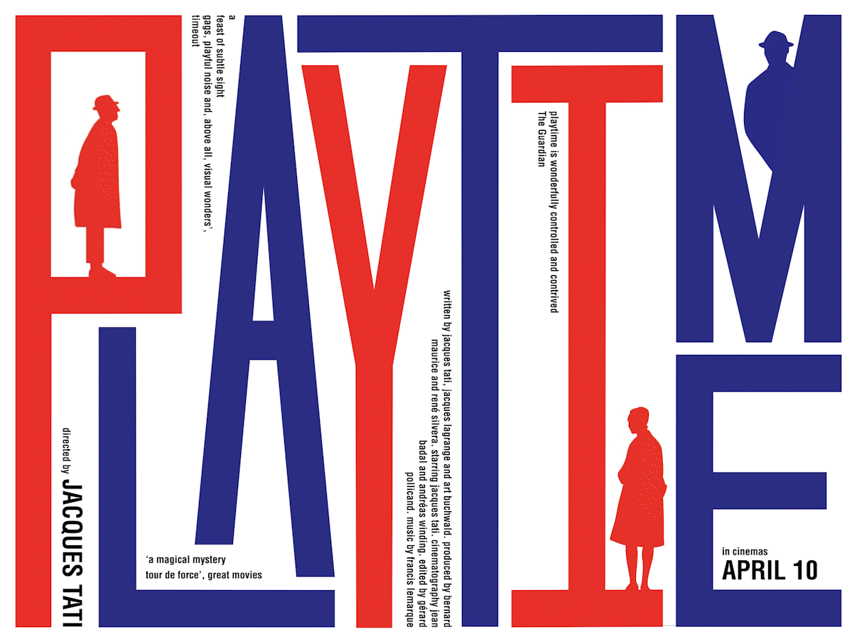
The poster's design focuses on the theme of "order vs. chaos", as seen in the film. I've chosen to convey this by illustrating a sense of being trapped in a highly structured, industrial world where individual identity and creativity are challenged by conformity. The industrial world is represented mainly by tall, organised text that mirrors the popular brutalist architecture of 1960s Paris. The chaos is depicted using playful illustrations of characters from the film Playtime.

poster Design.
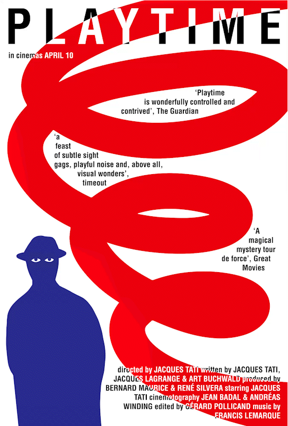
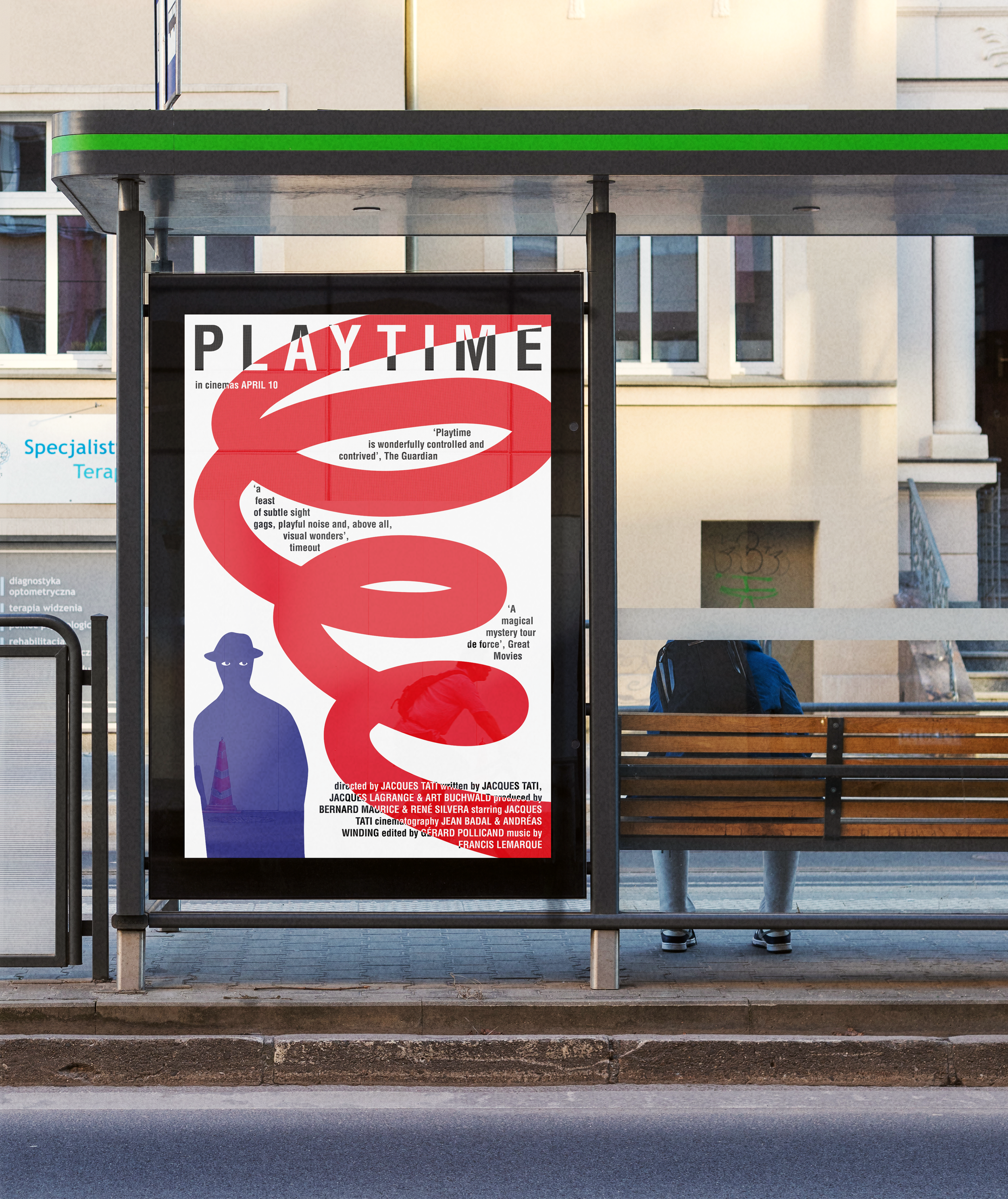
As part of the briefing, I was tasked with creating poster designs and presenting them in a contemporary style. Recognising the diminishing effectiveness of static posters, I made the decision to leverage modern LED billboard screens. The incorporation of motion graphics in the design was intentional, with an emphasis on minimal movement to draw attention. Amongst the abundance of advertisements presented to the public, the strategic use of subtle movement was intended to prompt individuals to take a second glance and contemplate whether the seemingly static poster was, in fact, in motion.

Artistic Development.
Here are two examples that were not included in the final submission. Nevertheless, they represented crucial milestones in achieving final outcomes and provide valuable insight into my process.
